 Crossing Broad
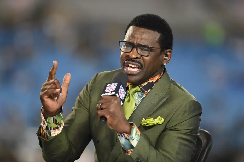
Michael Irvin has had a long, contentious history with the city of Philadelphia. As a Cowboys great who won three Super Bowls in the ’90s – a time when the Birds weren’t much to write home about – the Hall of Famer spent plenty of afternoons getting booed at Veterans Stadium (and, one time, regrettably, cheered). So it’s only right that he trolls the city whenever he gets the chance. And honestly, credit where it’s due: his troll job from Monday before the Home Run Derby was pretty good:
“When I came in here earlier, and I wanted to take a picture right here under the big Phillies sign right there, everybody started saying, ‘Michael, what are you doing? Why are you taking a picture under the Phillies sign? Why do you want a picture under the Phillies sign?’ I said, ‘Stop it. I’m not taking a picture with the Phillies sign. I’m taking a picture with them two blue Cowboy stars that’s on that Phillies sign. It’s the blue star that counts.’ After they see this video, Philly is going to be so mad about it. I promise you, you give it within a few years, within two years they’re gonna change them stars off of there. Them stars will not be like that, I guarantee. They’re gonna change that sign. No way.”
Look, you gotta give it up to the guy: This is a solid observation. I am in the business of observations. In a lot of ways, my job is pretty much just to look at stuff for a while and spot things that other people don’t, then find a way to package those observations in an interesting or funny way. And to think that Michael Irvin noticed something that I haven’t in the Phillies logo – a logo I’ve been staring at for my entire life – is impressive. He’s right. The two blue stars dotting the Phillies “I’s” look just like the Cowboys blue star:
Now, do I think he’s way off base about Philly fans being mad about this? Of course. That’s insane. No one’s actually going to care that the stars look like the Dallas star. A star is a star. That’s a pretty standard shape. Beyond the main shapes (circle, square, rectangle, etc.), it’s right there, in that second tier. It’s gotta be a top-10 most common shape. Maybe top 15. Also, the Phillies logo/font rules. Everyone loves it. No one in Philly is ever going to demand that the stars are removed, let alone within two years, as he predicted.
But still, you gotta tip your cap: it’s a very solid troll job. It’s also very original, which I appreciate. Not that I think it has a ton of staying power. I doubt this is going to be one of those “once you see it, you can’t unsee it” situations. But I do suspect that now and then, when I see the Phillies logo, the Dallas star similarity will pop...