I hope by now you’re hooked on the whole “Skarekrow is making something” deal happening in this series. If so, that means you’ve seen me mention multiple times that my friend bought us both Black Series helmets to decorate Buffalo Bills style.
Let’s take a little detour on my path then and show you what his vision was.
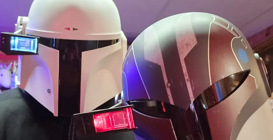
Let’s take a stroll back down memory lane and revisit the photo of my friend and I posing with our helmets fresh out of the boxes. Remember that mine is the Sabine Wren one. That’s the forefront of the picture if you’re not familiar with the various Mandalorian characters.
For the most part his is recognizable as Boba Fett. Without the iconic green paint it could be mistaken for a different character’s lid. This specific model is called the “prototype” variant and yes, it’s entirely white. You might be starting to understand the insinuation from the title about simplicity.
I’ve been discussing my process but if for some reason you’re in need of a reminder, it involves a lot of sanding, taping, stenciling, and spray painting. I’m using four different paint colors, with three different paint types (textured, metallic, and gloss). All that is before you factor in all the plastic work I’ll be diving into for the armor.
He went with the white helmet so he could take a different path. Decals. Professional grade decals, like the ones that go on the actual helmets. How did he do?
Judging by the front view, pretty ****ing awesome. Let’s take a look at the side view.
Standing buffalo logo, even placement. Still looking great.
And now for the look at the back. Can’t forget the shield, the flag and the green dot to make sure everyone knows that this helmet is authorized to be using the comlink on the field.
As I write this, on my cell phone I have side-by-side pictures of the finished products of both helmets. Was simple better? I think his work makes a good case for it, though you’ll need to wait for the comparison.
I asked him how long it took to do his design. Thirty minutes. I spent about that long on the tape. On just the visor I mean. I’m proud of what I did on mine, but looking at both, I’m not confident there’s a jump in quality or look. The side-by-side picture might have accidentally made a good image to illustrate the phrase “work smarter, not harder.”
When this picture was taken, the most significant portion of the painting was done and I had a little detail to toss on that required re-bagging to protect the thing you can sorta see in this image. If you recall my ****ty sketches from earlier on, you likely know what this is, but trust me the bagged teaser above has...


