 New England Patriots - NESN.com
We finally have seen the Patriots’ “Rivalry Uniforms” — and they aren’t good. In fact, they might be some of the worst alternate uniforms in Boston sports history.
On Thursday, the NFL revealed one-off “Rivalry Uniforms” that will be worn by NFC West and AFC East teams this season. The Patriots will wear their version — dubbed the “Nor’easter” uniform — on Nov. 13 when they host the New York Jets for the Week 11 edition of “Thursday Night Football.”
Anyway, let’s look at these disasters.
We get what the Patriots were going for. Snowstorms, the ocean, and general New England vibes. You know, cold-weather stuff. The problem is that the final product looks like something the Tennessee Titans would wear by accident.
“Created with the power and unpredictability of a New England storm in mind, the Nor’easter uniform blends the region’s natural elements, rich maritime history, and football tradition into a bold, future-forward design,” the Patriots wrote in a story on their official website.
“At the heart of the look is a deep Storm Blue base – rugged, weathered, and worn in, like the coastline after a gale. The color reflects both the unforgiving power of nor’easters and the perseverance of the people who face them head-on.”
Not to go full-Cracker Barrel, but that’s some corporate focus-group nonsense. Nobody cares about the history lesson behind what, at its core, is just test-run rebranding; they just care whether it looks good. And these don’t.
Reactions were mixed online, but negativity was the prevailing sentiment. And many fans lamented a missed opportunity to bring back the Drew Bledsoe-era “electric blue” uniforms.
Well, not to worry, aggrieved fans: The Patriots did resurrect the Bledsoe uniforms. Kind of.
From the team’s website:
Subtle design elements throughout the uniform connect New England’s past, present, and future:
Six stars on the uniform represent the six New England states.
A new “NE” shoulder logo, inspired by nautical lettering and compass points, underscores the unique nature of the Patriots as the only team to represent an entire region.
Jersey numbers pull their vertical striping and mesh-like design from the iconic 1990s Patriots uniform, evoking memories of Bledsoe-era battles.
Shoulder and pant stripes carry a subtle netting pattern, an homage to the working harbors that define the New England coast.
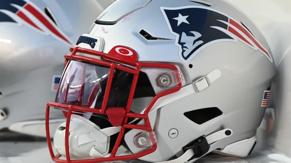
The matte white helmet reminds us of snow; the metallic silver facemask reflects the icy cold that defines the region’s winters.
Small pops of red offer a quiet connection back to the team’s traditional color palette.
And inside every collar, a reminder that through every storm, We Are All Patriots.
Yeah, no, sorry. You don’t get to blend faux-nostalgia and corporate jargon in an attempt to pass garbage off as flowers. The uniforms stink.
Honestly, the more you look at this whole thing, the more AI-slop it feels. And no, that’s not a serious accusation. Probably.
With all that said, these uniforms do have one thing going for them: They aren’t...