Super Bowl logos aren’t just about flashy designs; they tell a story, capture the spirit of the game, and sometimes even give a nod to the host city’s culture. Every year, fans eagerly wait to see how the NFL will mix creativity with tradition. Some logos have been instant hits, while others have sparked debates.
With the 2025 Super Bowl coming up, let’s take a trip down memory lane and check out five of the most unforgettable Super Bowl logos that had everyone talking.
Super Bowl L (50) was a historic event, and the logo reflected just that. Breaking away from tradition, the design prominently featured the Vince Lombardi Trophy in front of a massive golden “50.” While the trophy has been a standard element since 2011, this particular logo stood out due to its celebration of the Super Bowl’s 50th anniversary. The gold hue gave it a prestigious look, making it one of the most significant logos in the game’s history.
Super Bowl V’s logo remains one of the most visually distinct designs in Super Bowl history. Featuring bold blue and red hues, it gave off a neon glow that instantly transported fans back to the early ‘70s. The Baltimore Colts defeated the Dallas Cowboys in this championship, but the logo’s eye-catching design continues to be a topic of admiration. With its vintage neon sign feel, this logo is a true classic in Super Bowl history.
Super Bowl XII’s logo continues to generate discussions decades later. The Pittsburgh Steelers emerged victorious over the Dallas Cowboys, but the logo’s design gave NFL fans something extra to remember. With its blocky, arcade-inspired design, it bore a striking resemblance to the video game era that was just beginning to boom. With Pac-Man launching in 1980 and Space Invaders making waves in 1978, this logo perfectly captured the growing gaming culture of the time.
@NFL, This year’s SuperBowl logo has to be the ugliest championship game/finals logo in sports history. It looks hideous on both uniforms. Why does the logo have to incorporate the city it’s being played in? All went down hill in 2022. Fire whoever is in charge of this decision. pic.twitter.com/Q6X9b2KlY5
— Loootter (@Lootter96) January 29, 2025
Also Read: Ranking The Top 5 Teams With The Most Super Bowl Wins
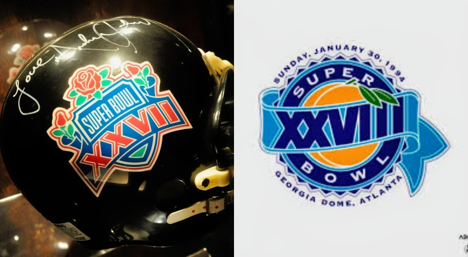
Super Bowl XXVIII featured a rematch between the Dallas Cowboys and Buffalo Bills. The logo, however, stole the spotlight. The game took place at the Georgia Dome in Atlanta, Georgia. Blue and yellow tones dominated the vibrant design. A plump Georgia peach highlighted the logo, honoring the state’s famous fruit. This unique design stood out and remains one of the most iconic logos in the history of the game.


