The Broncos only needed to take a page out of the Chargers’ book for re-designing a uniform kit but that just wasn’t in the cards for the divisional rival.
Another new uniform reveal for a NFL team, another complete disappointment from the fan base.
It’s easy to look down on other franchises attempting to re-design their looks when you’re the Los Angeles Chargers. If there’s anything the team got right over the past five years, it was the decision to draft Justin Herbert and their uniform re-design in April of 2020. The Chargers managed to not only get the design right, but they also hit the nail on the head to make their powder blues the defining color of the kit. They embraced the colorway that is almost entirely unique to them in the sports world and they now arguably have the best uniforms in the NFL.
They kept it simple and did not overthink a thing.
As for the Broncos? Someone, somewhere, made a wrong decision and it seemed to snowball into one of the worst uniform re-designs of the past decade.
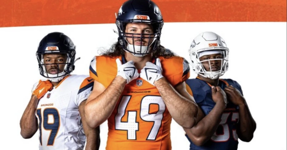
Without further ado, here are the newest uniforms for the Denver Virginia UTSA Cavalier Roadrunner Broncos:
I mean, come on. Not ONE person noticed that they looked a little too...familiar? There are half a dozen college schools with this color scheme and the Broncos somehow combined them all.
As for the smaller details of the design, the Broncos have described them here:
In my honest opinion, some of the details they hoped would have a ton of meaning for Denver natives just fall flat for me.
The design on the shoulder pads are supposed to be reminiscent of a mountain peak. However, it’s just a jagged line with no additional detail. No apparent snowcap or something to bring it all together. It doesn’t look much different from the bolt on the Chargers’ jerseys. That’s such a wildly weak attempt. “This jagged line creates a peak-looking shape and we’re calling it a mountain because Colorado has mountains.”
Come on.
Then there’s the number 5,280 worked into the design which signifies Mile High Stadium being 5,280 feet above sea level. Hey, that’s not a bad idea to incorporate! But why did you place it dead on the forehead of the helmet? A four-digit number is far too clunky to place so front-and-center. They also placed the number on the pant leg which I think is just fine. When it comes to numbers, especially those placed at such a focal point, don’t ever go above three digits. Don’t ask me to explain the reasoning behind that but trust me that it makes perfect sense.
Other than that, there’s simply nothing here that truly screams “Denver Broncos.” If anything, it screams a lot of other things. Here’s just a small fractions of the initial criticisms of the uniforms as of Monday afternoon: